I’m looking to recreate the file picker modal and as part of that I’m trying to do the sort & list/grid view popovers.
<s-button commandFor="sort" command="--toggle" icon="sort">
  Sort
</s-button>

<s-popover id="sort">
  <s-box padding="small-200 base">
    <s-choice-list label="Sort" labelAccessibilityVisibility="exclusive">
      <s-choice value="createdAtDesc">Date added (newest first)</s-choice>
      <s-choice value="createdAtAsc">Date added (oldest first)</s-choice>
    </s-choice-list>
  </s-box>
</s-popover>
This works fine outside of the modal but doesn’t seem to work or do anything inside the modal. The button shows a “pressed” state but I see no popover
I’ve found that you can get the popover to work by having the popover be outside the modal however the popover renders under the modal
import { useId } from "react";

export type FormFilePickerProps = {
	label: string;
	details?: string;
};

export default function FormFilePicker({ label, details }: FormFilePickerProps) {
	const id = useId();

	return (
		<>
			<s-popover id="sort-1">
				<s-box padding="small-200 base">
					<s-choice-list label="Sort" labelAccessibilityVisibility="exclusive">
						<s-choice value="createdAtDesc">Date added (newest first)</s-choice>
						<s-choice value="createdAtAsc">Date added (oldest first)</s-choice>
					</s-choice-list>
				</s-box>
			</s-popover>

			<s-modal id={id} size="large" heading="Select image" padding="none">
				<s-stack>
					<s-box padding="small-100 large">
						<s-stack direction="inline" gap="base" justifyContent="space-between">
							<s-box inlineSize="55%">
								<s-search-field
									label="Search files"
									labelAccessibilityVisibility="exclusive"
									placeholder="Search files"
								/>
							</s-box>

							<s-box>
								<s-stack direction="inline" gap="small-200">
									<s-button commandFor="sort-1" command="--auto" icon="sort">
										Sort
									</s-button>
								</s-stack>
							</s-box>
						</s-stack>
					</s-box>
				</s-stack>

				<s-button slot="secondary-actions" commandFor={id} command="--hide">
					Cancel
				</s-button>

				<s-button slot="primary-action" variant="primary" commandFor={id} command="--hide">
					Done
				</s-button>
			</s-modal>

			<s-clickable padding="small-200" borderRadius="base" commandFor={id} command="--show">
				<s-grid gridTemplateColumns="auto 1fr auto" gap="base" alignItems="center">
					<s-grid-item>
						<s-box
							borderRadius="base"
							borderWidth="large"
							borderStyle="dashed"
							borderColor="strong"
							blockSize="60px"
							inlineSize="60px"
						>
							<s-stack blockSize="100%" inlineSize="100%" alignItems="center" justifyContent="center">
								<s-icon type="image" />
							</s-stack>
						</s-box>
					</s-grid-item>

					<s-grid-item>
						<s-stack direction="block" gap="none">
							<s-text type="strong">{label}</s-text>

							{details && <s-text color="subdued">{details}</s-text>}
						</s-stack>
					</s-grid-item>

					<s-grid-item>
						<s-icon type="plus-circle" color="base" />
					</s-grid-item>
				</s-grid>
			</s-clickable>
		</>
	);
}
Alan_G
October 6, 2025, 9:57pm
3
Thanks for flagging this @DanGamble I’ll see if I’m able to replicate this and bring this to the team to take a closer look into this for you. Appreciate you sharing the repro code here as well. Speak with you again as soon as I have more info to share
Alan_G
October 7, 2025, 9:21pm
4
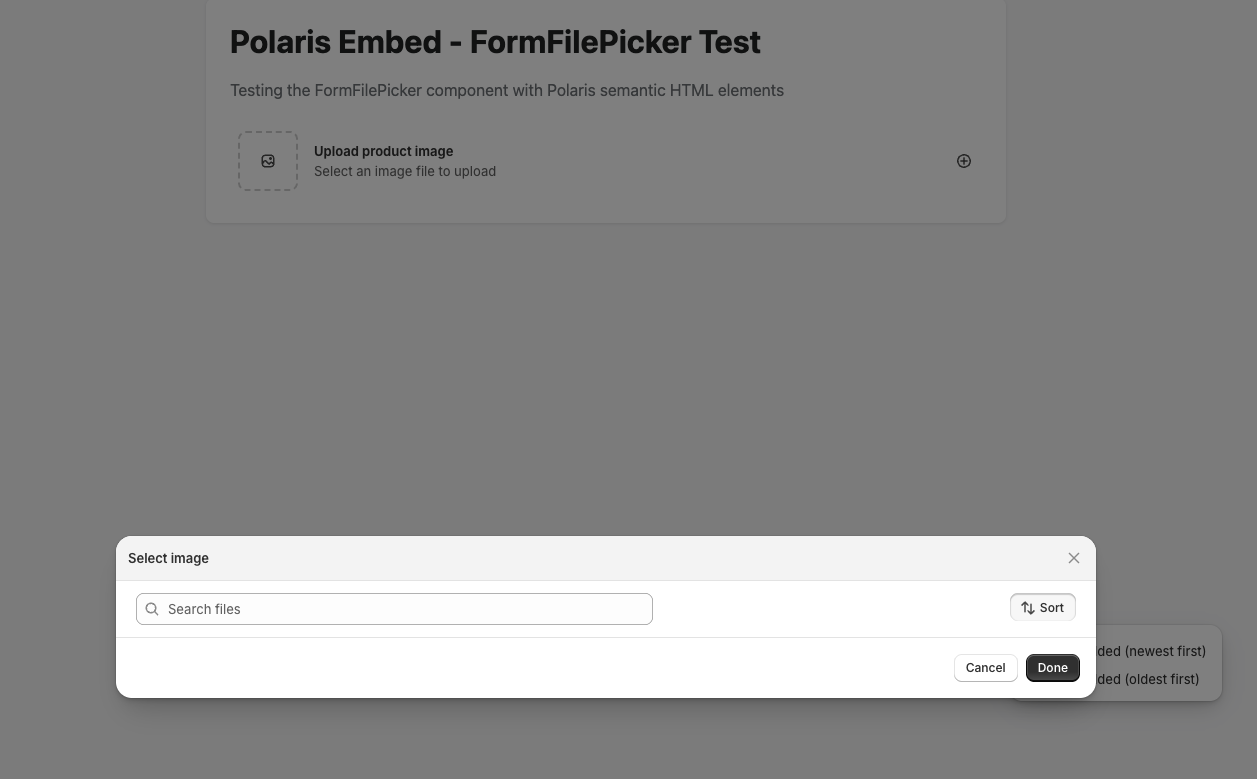
Hey @DanGamble , I think I’ve been able to replicate the issue. Here’s what I’m seeing on my end:
Just want to confirm, what you’re seeing is that there is an initial pop-up and then if we click “sort”, for example, the modal appears under the initial pop-up? Sharing a very basic HTML mock up where I replicated this just to confirm this is the same behaviour:
<!DOCTYPE html>
<html lang="en">
<head>
	<meta charset="UTF-8">
	<meta name="viewport" content="width=device-width, initial-scale=1.0">
	<title>Polaris Embed - FormFilePicker Test</title>
	<script src="https://cdn.shopify.com/shopifycloud/polaris.js"></script>
	<style>
		body {
			font-family: -apple-system, BlinkMacSystemFont, 'Segoe UI', Roboto, Oxygen, Ubuntu, Cantarell, sans-serif;
			padding: 40px;
			max-width: 800px;
			margin: 0 auto;
			background-color: #f6f6f7;
		}
		.container {
			background: white;
			padding: 24px;
			border-radius: 8px;
			box-shadow: 0 1px 3px rgba(0,0,0,0.1);
		}
		h1 {
			margin-top: 0;
			color: #202223;
		}
		.description {
			color: #6d7175;
			margin-bottom: 24px;
		}
	</style>
</head>
<body>
	<div class="container">
		<h1>Polaris Embed - FormFilePicker Test</h1>
		<p class="description">Testing the FormFilePicker component with Polaris semantic HTML elements</p>

		<div id="form-file-picker-container">
			<s-popover id="sort-1">
				<s-box padding="small-200 base">
					<s-choice-list label="Sort" labelaccessibilityvisibility="exclusive">
						<s-choice value="createdAtDesc">Date added (newest first)</s-choice>
						<s-choice value="createdAtAsc">Date added (oldest first)</s-choice>
					</s-choice-list>
				</s-box>
			</s-popover>

			<s-modal id="file-modal" size="large" heading="Select image" padding="none">
				<s-stack>
					<s-box padding="small-100 large">
						<s-stack direction="inline" gap="base" justifycontent="space-between">
							<s-box inlinesize="55%">
								<s-search-field
									label="Search files"
									labelaccessibilityvisibility="exclusive"
									placeholder="Search files"
								></s-search-field>
							</s-box>

							<s-box>
								<s-stack direction="inline" gap="small-200">
									<s-button commandfor="sort-1" command="--auto" icon="sort">
										Sort
									</s-button>
								</s-stack>
							</s-box>
						</s-stack>
					</s-box>
				</s-stack>

				<s-button slot="secondary-actions" commandfor="file-modal" command="--hide">
					Cancel
				</s-button>

				<s-button slot="primary-action" variant="primary" commandfor="file-modal" command="--hide">
					Done
				</s-button>
			</s-modal>

			<s-clickable padding="small-200" borderradius="base" commandfor="file-modal" command="--show">
				<s-grid gridtemplatecolumns="auto 1fr auto" gap="base" alignitems="center">
					<s-grid-item>
						<s-box
							borderradius="base"
							borderwidth="large"
							borderstyle="dashed"
							bordercolor="strong"
							blocksize="60px"
							inlinesize="60px"
						>
							<s-stack blocksize="100%" inlinesize="100%" alignitems="center" justifycontent="center">
								<s-icon type="image"></s-icon>
							</s-stack>
						</s-box>
					</s-grid-item>

					<s-grid-item>
						<s-stack direction="block" gap="none">
							<s-text type="strong">Upload product image</s-text>
							<s-text color="subdued">Select an image file to upload</s-text>
						</s-stack>
					</s-grid-item>

					<s-grid-item>
						<s-icon type="plus-circle" color="base"></s-icon>
					</s-grid-item>
				</s-grid>
			</s-clickable>
		</div>
	</div>

	<script>
		// Wait for Polaris embed to be ready
		console.log('Page loaded, waiting for Polaris components...');

		// Log if components are defined
		setTimeout(() => {
			console.log('s-modal defined:', customElements.get('s-modal'));
			console.log('s-clickable defined:', customElements.get('s-clickable'));
			console.log('s-button defined:', customElements.get('s-button'));
		}, 1000);
	</script>
</body>
</html>
Let me know if this is what you’re seeing and I’d be happy to look at this with the team. Hope to hear from you soon and thanks again for your patience on this!
Hey Alan,
Yea, that’s the one. I’ll open the modal initially and then when I click the “sort” button it’ll open the popover but below the modal itself.
I can provide a small screen recording if my above explanation/confirmation isn’t enough!
Alan_G
October 9, 2025, 3:08pm
6
Thanks for confirming @DanGamble and no worries. I think since it’s occurring even in a basic HTML integration we have enough to work with on our end. I’ll get in touch with some folks internally on my end here and we’ll investigate this for you. I’ll loop back with you here when I can confirm next steps
Has this problem been solved? I have also encountered the same problem
