I’m migrating both checkout and admin extensions to Polaris web components. Admin was smooth sailing, the changes there are genuinely great. Checkout though… it’s more challenging and feels like some functionality got dropped.
Overall I’m happy with the unification of Polaris components across surfaces, the API is cleaner and more consistent which is awesome. But hitting some real blockers:
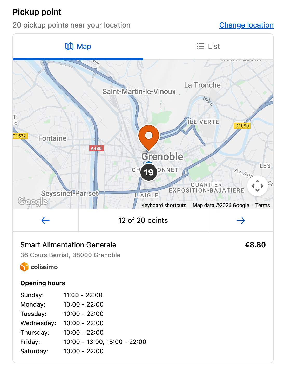
The old React View had a position property for absolute/relative/sticky positioning. Used this for overlaying UI elements like floating a pickup point selection card over a map. The new Box doesn’t have positioning at all. Is there a recommended pattern for this or another component I should be using?
The @container syntax for responsive values is confusing and seems incomplete. I’m trying to do conditional border styles like border="@container (inline-size > 500px) base, none" but TypeScript errors out. Can’t figure out the right syntax or if certain properties just don’t work with container queries. The old Style.default().when() helper handled everything seamlessly - is there better documentation on what works with @container?
There’s no clear list of what got removed in the migration. I keep discovering things by breaking my app - like <Map> lost the onZoomChange callback. Would really help to have a migration guide that calls out removed features instead of finding out through trial and error.
Anyone else migrating checkout extensions and hitting similar issues? Any workarounds for overlays without position support? Really excited about where this is going but need some guidance on these gaps.
Hey @Patrick_Jakubik thank you for the detailed feedback. We’ll look into getting a more robust guide up for partners that shows what has changed between 2025-07 and 2025-10.
For Box we currently do not support position, that’s right. We’ll take this feedback into consideration. I think for your Map example you could make use of Popover with MapMarker to create similar functionality or move the pickup point selection card to outside the Map altogether.
For @container we currently do not support conditional border styles. Please reference the docs or types to see what props are currently available for use on container queries (for example for inlineSize you’ll see the MaybeResponsive generic, but with border you won’t)
Having position support would be huge for us. We tried Popover early on but it doesn’t work for our use case - it opens where you click, which isn’t mobile-friendly. The standard pattern (like maps.google.com) shows details in a sidebar on desktop or bottom sheet on mobile. Without positioning, we can’t implement this UX that users actually expect.
I understand you’re consolidating APIs, but from our perspective this update creates a lot of migration work while actually removing functionality we rely on. Building checkout extensions that work well on mobile and desktop is already extremely challenging. Losing tools like positioning and callbacks makes it harder, not easier. What’s the benefit to us as extension developers?
On a practical note - can we do partial migration? We’ve built admin extensions on 2025-10 that are ready to ship, but we can’t launch them until the checkout migration is complete. Right now mixing 2025-10 (Preact) and 2025-07 (React) extensions in the same project throws CLI errors. Is supporting mixed API versions something you’re planning to enable?
I really do appreciate the direction with unified Polaris components - it’s cleaner when it works. Just need clarity on how to bridge these gaps without degrading our user experience.
Hey @Patrick_Jakubik - just realized there’s a new onViewChange callback that should have location and zoom available on the event and replace onZoomChange and onCenterChange. Please test that and let us know if that works. As for partial migrations/having a single app that has different extensions targeting different API versions, this should be doable. Can you share the CLI errors you’re seeing and provide some context around the app that’s being migrated (e.g., is it a remix app, does it use js or ts, etc.)?
There is no 2025.10 version of React package. On our main branch (without any updates to 2025-10 besides the ui-extensions package), I get this output from CLI when running dev command:
I’ve successfully resolved the Shopify CLI issues and made progress with the partial migration. However, I’m now stuck on our last extension - which is the most critical one for our app - because it relies on functionality that was removed in the 2025-10 release (specifically, absolute positioning and StyleHelper).
Just to recap, on 2025-10:
I’m unable to position the selected pickup point box in the top left corner on desktop and at the bottom of the screen on mobile
I’m also unable to implement autocomplete suggestions
I wanted to check if there are any plans to address these limitations in upcoming updates? Maintaining the current extension UX is really important to us - please see screen recording. We’re a public app with many Plus merchants who specifically value this experience.
Hey Patrick, sorry for not getting back to you with a response earlier. We made the decision to stop supporting absolute positioning because its inappropriate use, led to issues. In the absence of that, there’s no way for you to reproduce your exact UI, right now. For now, there are a few alternatives we would recommend:
To solve both the autocomplete and marker problems at once you could: split the modal you have into a 2-column layout. One side would have the search bar, search results as well as the marker details, while the other side will have the map. This is very similar to maps.google.com and would address both the marker and autocomplete gaps. See image below for example:
For the marker alone, besides option 1, you could consider following the pattern we use in our native Pickup Point feature and show the marker details below the Map on both large and small screens, or use the existing popover component inside the Map. See the image below for an example:
For the Autocomplete alone, besides option 1: your other options here would be to either just render the results above the Map such that either the Map gets pushed down or reduced in size (e.g: using 1fr height within a Grid to take as much space as possible). Or settling for just a search feature until we provide an autocomplete component.
In the long term we plan to update component library, so your original experience is possible, but we don’t have a timeline for those improvements yet.