Hey Patrick, sorry for not getting back to you with a response earlier. We made the decision to stop supporting absolute positioning because its inappropriate use, led to issues. In the absence of that, there’s no way for you to reproduce your exact UI, right now. For now, there are a few alternatives we would recommend:
-
To solve both the autocomplete and marker problems at once you could: split the modal you have into a 2-column layout. One side would have the search bar, search results as well as the marker details, while the other side will have the map. This is very similar to maps.google.com and would address both the marker and autocomplete gaps. See image below for example:
-
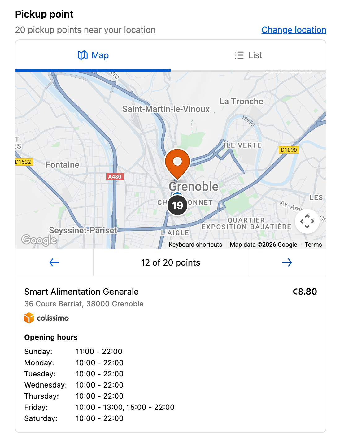
For the marker alone, besides option 1, you could consider following the pattern we use in our native Pickup Point feature and show the marker details below the Map on both large and small screens, or use the existing
popovercomponent inside the Map. See the image below for an example:
-
For the Autocomplete alone, besides option 1: your other options here would be to either just render the results above the Map such that either the Map gets pushed down or reduced in size (e.g: using
1frheight within aGridto take as much space as possible). Or settling for just a search feature until we provide an autocomplete component.

In the long term we plan to update component library, so your original experience is possible, but we don’t have a timeline for those improvements yet.