Hi everyone,
I’m working with Shopify Polaris Web Components and using the <s-button> component. I noticed that there’s no option for setting a “pressed” state on the button.
In the Polaris React version, we have the ability to use the pressed prop, which is especially useful when working with a ButtonGroup for toggle-like behavior.
Reference:
Is this functionality planned for s-button in Web Components, or is there a recommended workaround to achieve the same behavior?
Thanks in advance for any suggestions!
Alan_G
September 25, 2025, 7:19pm
3
Hey @jaymit_b
Let me know if I can clarify anything more on my end here.
Alan_G
September 29, 2025, 4:11pm
4
Just going to close this thread out, since we are looking into this in the medium-term, but let me know if I can help out further
navdeep
November 9, 2025, 10:55am
5
Hi @Alan_G ,
Any updates on having a pressed state in buttongroup in web components?
You can use clickable chips with Javascript in the mean time to have tabs that visually show what is selected
<s-stack gap="base">
  <s-stack direction="inline">
    <!-- Tab navigation container -->
    <s-stack direction="inline" gap="small" border="base" borderradius="base" padding="small-400" background="base">
      <s-clickable-chip data-tab="account" color="strong" onclick="switchTab('account')">Account</s-clickable-chip>
      <s-clickable-chip data-tab="password" color="subdued" onclick="switchTab('password')">Password</s-clickable-chip>
    </s-stack>
  </s-stack>

  <!-- Tab content container -->
  <s-box border="base" borderradius="base" padding="base">
    <!-- Account tab content -->
    <div id="account-content" class="tab-content">
      <s-stack gap="base">
        <s-box>
          <s-heading>Account</s-heading>
          <s-text color="subdued">Update your personal and account information.</s-text>
        </s-box>
        <s-text-field label="Name" value="John Doe"></s-text-field>
        <s-text-field label="Username" value="@johndoe"></s-text-field>
        <s-button variant="primary">Save changes</s-button>
      </s-stack>
    </div>

    <!-- Password tab content -->
    <div id="password-content" class="tab-content" style="display: none;">
      <s-stack gap="base">
        <s-box>
          <s-heading>Password</s-heading>
          <s-text color="subdued">Always keep your passwords strong and secure.</s-text>
        </s-box>
        <s-text-field type="password" label="Current password"></s-text-field>
        <s-text-field type="password" label="New password"></s-text-field>
        <s-text-field type="password" label="Confirm password"></s-text-field>
        <s-button variant="primary">Update password</s-button>
      </s-stack>
    </div>
  </s-box>
</s-stack>
function switchTab(activeTab) {
  // Hide all tab content
  document.querySelectorAll('.tab-content').forEach(content => {
    content.style.display = 'none';
  });

  // Set all tabs to subdued (inactive state)
  document.querySelectorAll('[data-tab]').forEach(tab => {
    tab.setAttribute('color', 'subdued');
  });

  // Show active tab content
  document.getElementById(activeTab + '-content').style.display = 'block';

  // Highlight active tab (set to strong)
  document.querySelector('[data-tab="' + activeTab + '"]').setAttribute('color', 'strong');
}
navdeep
November 13, 2025, 4:16am
7
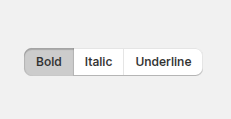
Thanks for sharing the code.. I am controlling my itch to use js. There is already a pressed button in polaris though not released yet.
but it does not support grouping like buttongroup
 , I’ve been looking into this a little bit and spoke with some folks internally on this/have a bit of an answer for things on our end! We are looking into implementing this into the Web Components version of Polaris at some point (likely medium-term), but I can’t confirm an exact timeline.

