Since Polaris React was deprecated I’m looking into migrating our whole admin dashboard to web components (while still using React). Using Polaris React I did things like this: <Text variant="headingLg" as="h2">But with <s-heading>I see no size options. How do I make the headings bigger? Or am I supposed to use <h2 className="my-own-bigger-heading-class">?
With the new web components heading sizes are automatically determined by nesting depth within <s-section> components. This ensures proper semantic HTML structure and accessibility. The deeper you nest sections, the smaller (and lower-level) the headings become automatically. You should only use <s-heading> when you need a custom layout that can’t be achieved with <s-section>.
Yeah, something is wrong. No matter where I place the <s-heading> its tiny. I just use <h2> and style it myself. Polaris changes fundamentally all the time, maybe I should completely migrate away from it anyway, this is so exhausting.
Look at this nonsense. The shadow dom style is stronger than anything and makes the headlines tiny! No style for the headline actually applies, just :host > *.

Code (excerpt):
        <s-stack gap="large">
            <s-section heading={t("help-card.about.title")}>
<p>Lorem ipsum dolor sit amet, consetetur sadipscing elitr, sed diam nonumy eirmod tempor invidunt ut labore et dolore magna aliquyam erat, sed diam voluptua. At vero eos et accusam et justo duo dolores et ea rebum. Stet clita kasd gubergren, no sea takimata sanctus est Lorem ipsum dolor sit amet. Lorem ipsum dolor sit amet, consetetur sadipscing elitr, sed diam nonumy eirmod tempor invidunt ut labore et dolore magna aliquyam erat, sed diam voluptua. At vero eos et accusam et justo duo dolores et ea rebum. Stet clita kasd gubergren, no sea takimata sanctus est Lorem ipsum dolor sit amet.</p>
</s-section>
</s-stack>
Can I just keep using Polaris-React forever or will something fundamentally break at some point? I have no time to rewrite the whole dashboard just because Shopify thinks they’re funny.
Appreciate the feedback here - we’re looking into strategies to improve this for devs. Nothing to share on an ETA, but if you have other examples like the pricing page please share them here.
Well, another thing I just noticed trying to implement the pricing page using Polaris web components: The green (success) variant of buttons doesn’t exist anymore and you can’t make buttons full with anymore either.
And because it uses shadow DOM I can’t fix this with my own CSS either!
I just tried and ignored TypeScript errors, if you set inlineSize="fill" the button is full width. But as I said TypeScript marks it as wrong (vite+esbuild ignores it). I.e. this is missing in @shopify/polaris-types.
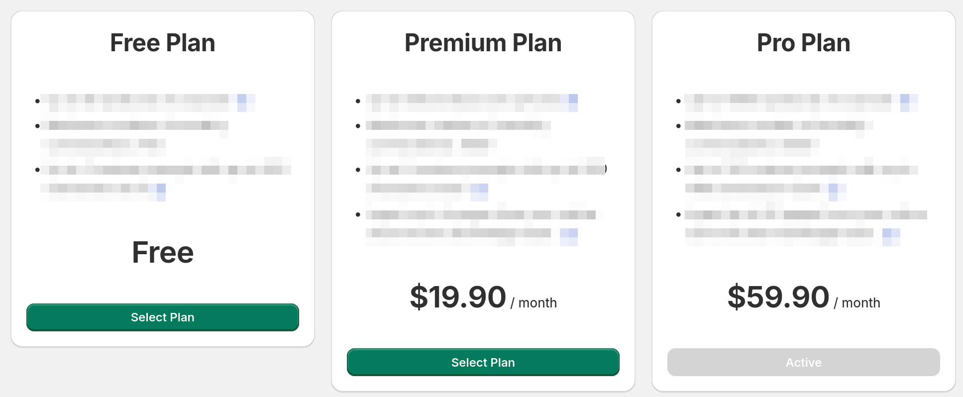
We also have a similar issue with headings + the plans page in our billing template - seems you may be able to use as=”h3” to get it to look like another element, but it doesn’t feel like the right way.
Would love some official direction on how we might adjust for things like this!
<s-heading> doesn’t have an as property/attribute. I’ve only seen the as properties in the React version of Polaris, but that is deprecated. That’s why I’m investigating moving to the web components version. But that implements a fraction of the features and because of the isolated shadow DOM you simply can’t fix certain tings with your own CSS.
Apologies - had misunderstood someone else asking me if it was possible as being possible  Just realised when I went to test it! In the same boat also
Still not fixed it seems. I think it’s best to just use standard HTML with your own CSS until they resolved this. I like most of the stuff that the web components bring, this just seems like an oversight to me.
You probably figured out how to do it with the web components but for anyone wondering: the <s-grid> component basically makes <Layout> obsolete. In the docs they have an example for a two-column layout.
I’m using Polaris React for as long as somehow possible.
I am also facing this issue. Can’t set my heading size to large.
All these new Polaris changes are a huge step backward. Stick to HTML and style everything yourself.
Actually insane we cannot manually set the text size, why not let us set the size we want like it was the case in React??
can we use native HTML element like h1 or h2 intead of heading?
analytics dashboard cards needs bigger titles for example. can think of a million more
