Hi Shopify team! 
I’m using the Text component from @shopify/ui-extensions-react/admin, and I noticed that some props aren’t being applied as expected. Here’s a simplified example:
import {Text, BlockStack} from '@shopify/ui-extensions-react/admin';

<BlockStack>
  <Text>Default</Text>
  <Text fontWeight="bold">Bold</Text>
  <Text fontWeight="light-300">Light</Text>
  <Text fontStyle="italic">Italic</Text>
</BlockStack>
Issue:

Default and Bold render correctly.
Light and Italic don’t apply the expected styles.- The output HTML shows all
Text components rendered with Polaris-Text--regular, even when setting fontWeight="light-300" or fontStyle="italic".
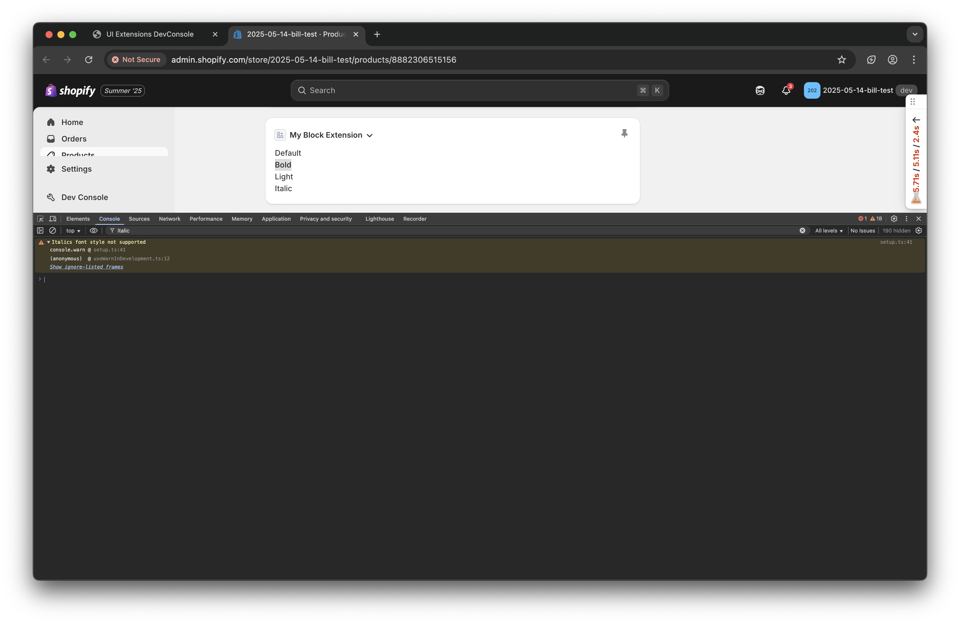
Here’s a screenshot for clarity:

Question:
Is this expected behavior or a known limitation? If not, could it be a bug or documentation gap?
I believe this is also happen to other props/component.
Thanks in advance for the help! 
Thank you for pointing this out. You’ve found a limitation in how early UI Extensions font weights mapped to Polaris styles. Since the Text component from @shopify/polaris only supports regular, medium, semibold, and bold, the UI Extensions weights are mapped as follows:
- All “
light” variants → regular (which is why light-300 looks the same as default)
bold → mediumbold-200 → semiboldbold-300 → bold
Additionally, fontStyle="italic" is not supported - you should see a warning about this in your browser console (see attached screenshot).
These are design constraints rather than bugs - Polaris doesn’t have lighter weight variants or italic styles.
For now, use bold, bold-200, or bold-300 to get different font weights.
Let me know if you have any questions!
Screenshot
1 Like
Thanks so much, @Bill-Shopify ! Quick follow-up: is there a way in an admin extension to use something like <Text tone="subdued">Example</Text>
or customize the fontSize? I tried using Paragraph (ref) but didn’t have much luck. Appreciate any guidance!