I’m using the s-text-field web component in React app, but the error styling isn’t working consistently. Sometimes it applies the related CSS classes, and sometimes it doesn’t. The issue mostly occurs when showing errors dynamically — it doesn’t work the first time, but works correctly afterward.


Thanks for flagging this - we’re investigating this issue now.
Could you let me know which version of React you’re using? Thanks!
I’m using the following versions of React:
"react": "^18.2.0",
"react-dom": "^18.2.0"
I got a reproduction with the following code:
// src/App.js
import React, { useState } from "react";

function App() {
  const [inputValue, setInputValue] = useState("");
  const [showError, setShowError] = useState(false);

  const handleValidate = (value) => {
    if (!value.trim()) {
      setShowError(true);
    } else {
      setShowError(false);
    }
  };

  const handleInputChange = (e) => {
    const value = e.target.value;
    setInputValue(value);
    handleValidate(value);
  };

  return (
    <div style={{ padding: "2rem" }}>
      <h1>Polaris Web Component - Dynamic Error</h1>

      <s-text-field
        label="Name"
        placeholder="Enter your name"
        value={inputValue}
        error={showError ? "Invalid!" : ""}
        onChange={handleInputChange}
      ></s-text-field>

      <br />
      <button onClick={() => handleValidate(inputValue)}>Validate</button>
    </div>
  );
}

export default App;
Hello, just checking in—any updates on this?
Hey @jaymit_b - thanks for following up. I still can’t guarantee a turnaround time on this, but can confirm there’s been movement toward a fix. We’ll keep an eye on this and let you know once it’s been shipped!
This should be fixed now. Thanks!
@Anthony_Frehner The issue is fixed on desktop and iPhone, but it still persists on iPad and Android devices.
Tablet/iPad:

Android:

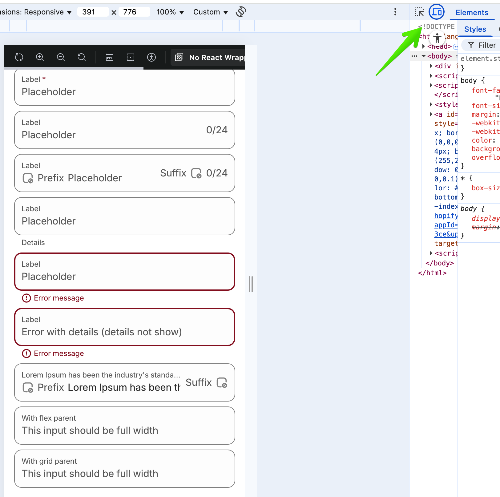
I think that looks almost correct to me on mobile. Our mobile styles differ slightly from desktop, especially for text field. If you want to preview what they are supposed to look like in your browser, you can visit the storybook and toggle mobile view from dev tools (screenshot attached).
It does appear like we should take a closer look at how our components are rendering in android though. Seems like the colors are off and things that are supposed to be inline are not inline. We’ll look into it
Hello @Kyle_Durand , in the screenshot you shared of Storybook, the error shown is the default one. Please also check for dynamic errors — for example, initially there’s no error, but if an invalid value is entered in the input field, it should display an error. Similarly, if no value is entered and the user tries to submit/save, it should show an “input required” error. In this scenario, I’m facing issues specifically on Android and iPad devices.
Can you tell me the Polaris version?