I’m working on a widget page for my Shopify app and I’m a bit confused about the correct layout for primary and secondary sections. According to the Shopify documentation, I need to show a preview of user data entry, but I’m not sure whether to use a 2/3 or 1/3 page layout.
Can anyone clarify which layout is correct for submitting a build to Shopify to ensure it gets approved without issues?
Hi Liam
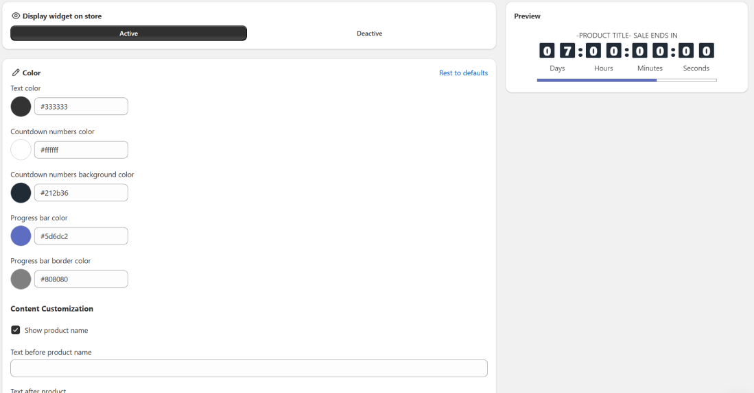
yes i reviewed this page but Im a little bit confused because it is not a setting page it is a separate page and my confusion is in the which one is primary and which one is second based on the layout and i see this link [Layout] as well which preview is bigger than data entry section.
Hi @Shahram_Foroozan, regarding 4.5.3 For visual editors, use two-column layouts, it is up to you to determine which content should reside in the 1/3-sized column and which content should reside in the 2/3-sized column (regarding the preview and the corresponding editor fields/controls).
This requirement exists to ensure that merchants can see both the preview and can interact with the corresponding editor controls at the same time. An app would fail to meet this BFS requirement if it required merchants to flip back and forth between the editor controls and the preview (i.e. if instead of using a two column layout, it required merchants to toggle between tabs or to open/close a separate preview modal).