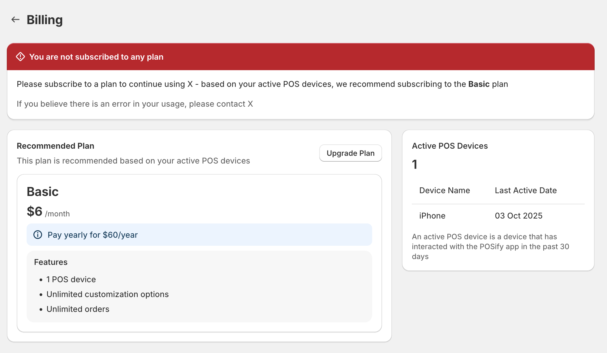
In the previous version of Polaris (before web components) it was possible to use the <Layout> component to structure pages into thirds. You could, for example, have a full width banner at the top of the page, and then divide the page below into 2 thirds and 1 third, e.g.:
    <Page
      title="Billing"
      compactTitle
    >
      <Layout>
        <Layout.Section>
          <Banner
              title={`You have exceeded your current plan usage`}
              tone="critical"
            >
              ...
            </Banner>
        </Layout.Section>
        <Layout.Section>
          ...
        </Layout.Section>
        <Layout.Section variant="oneThird">
          <Card roundedAbove="sm">
            ...
          </Card>
        </Layout.Section>
      </Layout>
    </Page>
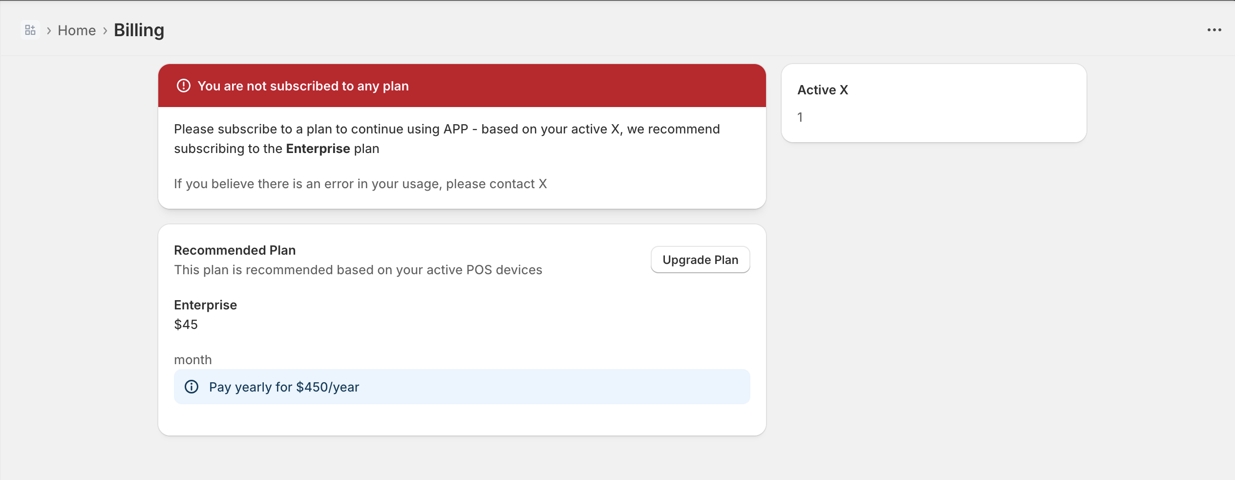
However, with the new Polaris web components, you need to use the aside slot on a page to split the page into 2 thirds and 1 third:
      <s-page heading="Billing">
        <s-banner>Test</s-banner>
        <s-link slot="breadcrumb-actions" href="/app">Home</s-link>
        <s-section>
          ...
        </s-section>
        <s-box slot="aside">
          ...
        </s-box>
      </s-page>
Which results in the banner being squahed into the 2 thirds - as opposed to be streched across the full width of the container, above the rest of the content:
If you move the banner outside of the page, you lose the container padding:
    <s-stack gap="base">
      <s-banner>Test</s-banner>
      <s-page heading="Billing">
        <s-link slot="breadcrumb-actions" href="/app">Home</s-link>
        <s-section>
          ...
        </s-section>
        <s-box slot="aside">
          ...
        </s-box>
      </s-page>
    </s-stack>

I’m strugging to find a component that automatically applies the page/container padding that is applied in the s-page component. I’ve looked at s-grid, but it looks as though I’d have to specify the responsive inlinePadding values to match the s-page padding, which just seens absurd.
Can somebody point me in the direction of how we should be rendering components above an asidecomponent?