s-table at the moment does not support the same row selection/action UI as the old IndexFilters and the UI used on Shopify’s own tables. I think a slot (perhaps toggled by a prop on the top level table) that renders over the header row would be nice. At the moment, I have to put the selection actions either outside the table or in the filters slot, but these aren’t as nice and don’t fit with the rest of the shopify UX.
It may help to stop thinking about what the web components do in comparison to the Polaris components. The web components are the newer design, and over time we will update Shopify to the web components and their behavior. So the comparisons don’t really help, as we aren’t really paying attention to them.
@Anthony_Frehner Ok, then the question I’d like an answer to would be how does Shopify plan to implement a row selection UI using the new components? There are no examples of this and to me it seems like the new components make designing a UX for this quite challenging. I presume Shopify intends to maintain their UX as they migrate?
I agree, forget about the comparison to Polaris react. I’m putting in time now to update my app to your new suggested component library that’s supposed to help my app match the design and functional UX of the rest of Shopify’s pages. I don’t think it’s too much to ask how one is meant to create this sort of functionality using the new components in a way that aligns with the Shopify UX.
So the comparisons don’t really help, as we aren’t really paying attention to them.
If the plan is for developers to be able to migrate their apps to the new components, it’s worth paying attention to how functionality that was readily achievable using the old framework should be achieved using the new one, because developers have built user experiences that rely on that functionality – as has Shopify. The new components have to support these cases in reasonably obvious ways to achieve its goals of creating consistent UX across apps and other pages.
I’m really stumped for a solution that works well on mobile and web. I really think this needs to be built-in to the component, since even a column of checkboxes done manually doesn’t really work with the mobile list view, let alone the positioning of the actions, etc.
@Anthony_Frehner is this something that the team is working on, still to be done? Or am I missing something in the current implementation? @Kyle_Durand thoughts?
So, I had a somewhat working solution (shared over at Share: What I'm building with the new Polaris Web Components - #11 by _Ryan) that used the page actions like below, but with an update to the web components library it no longer works. Previously, the code below worked like the screen cap below. Now, when selections are made, no buttons appear in the page actions. I wonder if this is related at all to the recent disappearance of buttons when icons are set (described at S-button do not show icons when in page action slots - #8 by _Ryan)?
@Alan_G can I get you to look into this? @Anthony_Frehner this kinda hurts the case against versioning the web components, discussed elsewhere, as this breaks my app that was previously working. It’s a major regression for me!
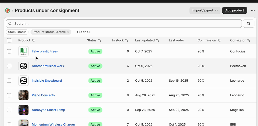
Old behaviour:
New behaviour:
no “products selected” menu appears
Code to recreate in your react-router template:
import { useCallback, useState } from "react";

interface DemoProduct {
  id: string;
  name: string;
  sku: string;
  price: string;
  stock: number;
  status: "active" | "archived";
  createdDate: string;
}

const DEMO_PRODUCTS: DemoProduct[] = [
  {
    id: "1",
    name: "Wireless Headphones",
    sku: "WH-001",
    price: "$79.99",
    stock: 45,
    status: "active",
    createdDate: "2024-10-15",
  },
  {
    id: "2",
    name: "USB-C Cable",
    sku: "UC-002",
    price: "$12.99",
    stock: 120,
    status: "active",
    createdDate: "2024-09-22",
  },
  {
    id: "3",
    name: "Phone Case",
    sku: "PC-003",
    price: "$24.99",
    stock: 0,
    status: "archived",
    createdDate: "2024-08-10",
  },
  {
    id: "4",
    name: "Screen Protector",
    sku: "SP-004",
    price: "$9.99",
    stock: 200,
    status: "active",
    createdDate: "2024-10-01",
  },
  {
    id: "5",
    name: "Portable Charger",
    sku: "PC-005",
    price: "$49.99",
    stock: 32,
    status: "active",
    createdDate: "2024-09-15",
  },
];

export default function TableDemo() {
  const [rowSelection, setRowSelection] = useState<Record<string, boolean>>({});

  const selectedCount = Object.values(rowSelection).filter((v) => v).length;

  const handleSelectAll = useCallback((checked: boolean) => {
    if (checked) {
      const allSelected: Record<string, boolean> = {};
      DEMO_PRODUCTS.forEach((product) => {
        allSelected[product.id] = true;
      });
      setRowSelection(allSelected);
    } else {
      setRowSelection({});
    }
  }, []);

  const handleRowSelect = useCallback((productId: string, checked: boolean) => {
    setRowSelection((prev) => ({
      ...prev,
      [productId]: checked,
    }));
  }, []);

  const allSelected = DEMO_PRODUCTS.every((p) => rowSelection[p.id]);

  return (
    <s-page heading="Table Demo">
      {selectedCount > 0 && (
        <>
          <s-button
            commandFor="bulk-actions-menu"
            accessibilityLabel="Selected product bulk actions"
            slot="secondary-actions"
          >
            {selectedCount} products selected
          </s-button>
          <s-menu accessibilityLabel="Bulk actions" id="bulk-actions-menu">
            <s-button icon="person">Assign to consignor</s-button>
            <s-button icon="person-remove" tone="critical">
              Remove from consignor
            </s-button>
            <s-button icon="money">Set commission</s-button>
          </s-menu>
        </>
      )}
      <s-section padding="none">
        <s-table>
          <s-table-header-row>
            <s-table-header listSlot="inline">
              <s-checkbox
                checked={allSelected}
                onChange={(e) => handleSelectAll(e.currentTarget.checked)}
              />
            </s-table-header>
            <s-table-header listSlot="primary">Product Name</s-table-header>
            <s-table-header>SKU</s-table-header>
            <s-table-header format="currency">Price</s-table-header>
            <s-table-header format="numeric">Stock Level</s-table-header>
            <s-table-header listSlot="secondary">Status</s-table-header>
            <s-table-header>Created Date</s-table-header>
          </s-table-header-row>

          <s-table-body>
            {DEMO_PRODUCTS.map((product) => (
              <s-table-row key={product.id}>
                <s-table-cell>
                  <s-checkbox
                    checked={rowSelection[product.id] ?? false}
                    onChange={(e) =>
                      handleRowSelect(product.id, e.currentTarget.checked)
                    }
                  />
                </s-table-cell>
                <s-table-cell>{product.name}</s-table-cell>
                <s-table-cell>{product.sku}</s-table-cell>
                <s-table-cell>{product.price}</s-table-cell>
                <s-table-cell>{product.stock}</s-table-cell>
                <s-table-cell>
                  <s-badge
                    tone={product.status === "active" ? "success" : "auto"}
                  >
                    {product.status}
                  </s-badge>
                </s-table-cell>
                <s-table-cell>{product.createdDate}</s-table-cell>
              </s-table-row>
            ))}
          </s-table-body>
        </s-table>
      </s-section>
    </s-page>
  );
}
The latest issue that breaks selection using this method seems to be related to the issue with icons being set for the s-button components described here: S-button do not show icons when in page action slots - #8 by _Ryan
Removing the icon prop for now fixes the issue.