Hi all,
I’m Nick, Design Lead on customer accounts. I am excited to share that we’re getting close to releasing design improvements that modernize the customer account experience and providing a stronger foundation for the UI extensions you’ve built on top. This is one of many exciting projects the team is working on as we continue to make customer accounts a valuable experience for your customers.
Today, we’re opening a feature preview so you can test your customer account UI extensions in the updated layout. What you’ll see is a work-in-progress version. We’ll keep making improvements throughout the preview, so your feedback directly shapes what merchants get at GA.
Why a visual uplift now
The visual refresh aims to create a more modern, intuitive experience that makes it easier for customers to navigate their account pages, take self-serve actions, and find and use the features you build.
The updated design adds a focused, single-column layout, with improved navigation and consistent responsiveness across devices.
Features you build are easier for customers to discover and use: order action extensions get increased visibility; order summary extensions are no longer hidden behind a tap on mobile; all current extension targets are mapped to the new layout in more prominent ways.
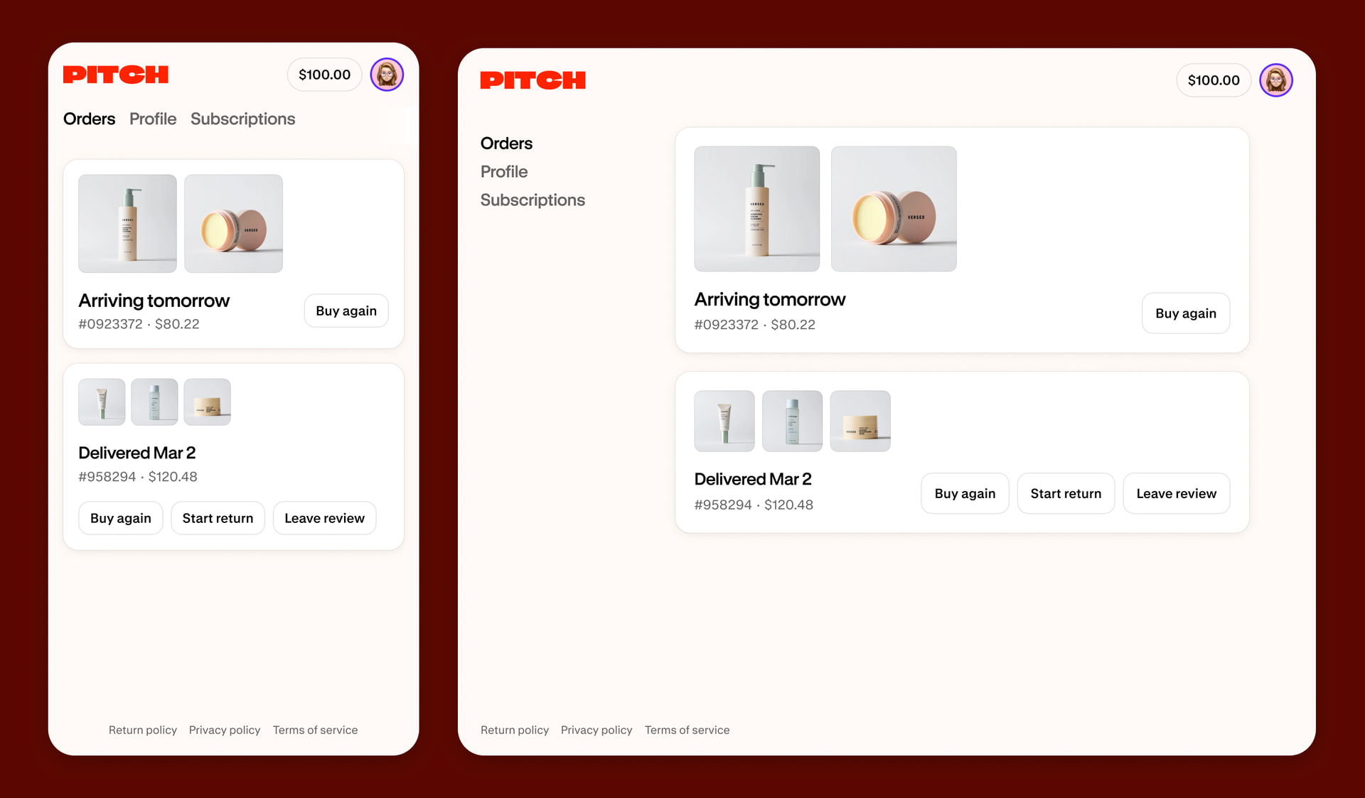
These changes don’t break your existing extensions. All current extension targets remain supported, but testing now will ensure your extensions will continue to look as intended or give you a head start on any tweaks that’ll help your extensions feel right at home when these design updates are released to merchants.
What you should test
If you’ve built customer account UI extensions, you can now test them in the new layout. Here’s what to focus on:
-
Inline extensions: These now render in a narrower page width instead of the previous wider layout. Check that text, images, and form elements still look right.
-
Full-page extensions: Adopt our mobile-first, narrow layout for a streamlined full-page extension that matches native pages, or expand to a wider layout for data-heavy content. All existing full-page extensions will continue to use the larger width. Learn more
-
Responsive behavior: Wrap any inline UI extensions that render on native pages in and use responsive values so the content automatically adjusts to different screen sizes.
How to start testing
Create a new dev store and enable the Customer Account Improvements feature preview to get early access to the changes. Follow our documentation for instruction details. The feature preview will be open until June 12, 2026.
Feedback is a gift
We’d love to hear your thoughts and suggestions. Please share in this thread what works well and what doesn’t for your extensions.
This preview is still under development and subject to change before the updates are released to merchants—this is the chance to help us shape the best experience possible for customer accounts.
Cheers,
Nick Lenko, Design Lead @ Customer Accounts

