Hello there!
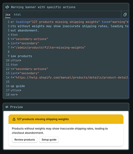
I am using Polaris Web Components for the first time in my app and I want to render a banner like the ones exemplified in this part of the official documentation, but I am getting a tottally different outcome than the one showcased in the mentioned documentation.
Here is what it should be rendered:
Here is my code:
 const bannerHTML = `
    <s-banner id="validation-warning-banner" tone="warning" heading="${t('sync.changes_detected')}">
      ${warningText}
      <s-button
        slot="secondary-actions"
        variant="secondary"
        command="show"
        commandFor="discrepancies-window">
        ${t('discrepancies.view_details')}
      </s-button>
    </s-banner>
  `;
And here is what it looks like when rendered:
As far as I know, I have no custom CSS targetting that element. I would expect the same look and feel (borders, shadow, two colour background, etc) but instead I get a plain version of it.
Any idea where I could be messing up? Probably a noob question but here we are ![]()
Thanks in advance!


